
What is Japandi Style and How to Create It
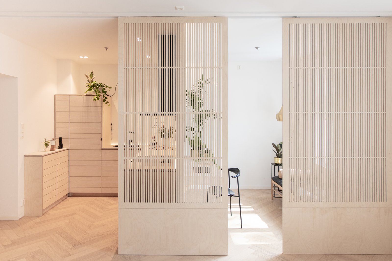
“Japandi” (aka Japanese + Scandi) is a hybrid interior design style that fuses traditional Japanese and Scandinavian concepts and aesthetics. It draws cultural influences and ideology from both ‘hygge’ and ‘wabi-sabi’ lifestyles. In my definition, Japandi hinges on simplicity at its core value that blends nature, function, and craft.
Japandi: a hybrid interior design style that perfectly pairs modern Scandinavian style with traditional Japanese aesthetics.
How to achieve this look in your home
It’s easy to start browsing through Pinterest for ‘Japandi’ ideas but how can you replicate the inspiration in your actual functioning home, while working a full-time job, maybe being a parent, and just living life.
Keep it simple & minimal
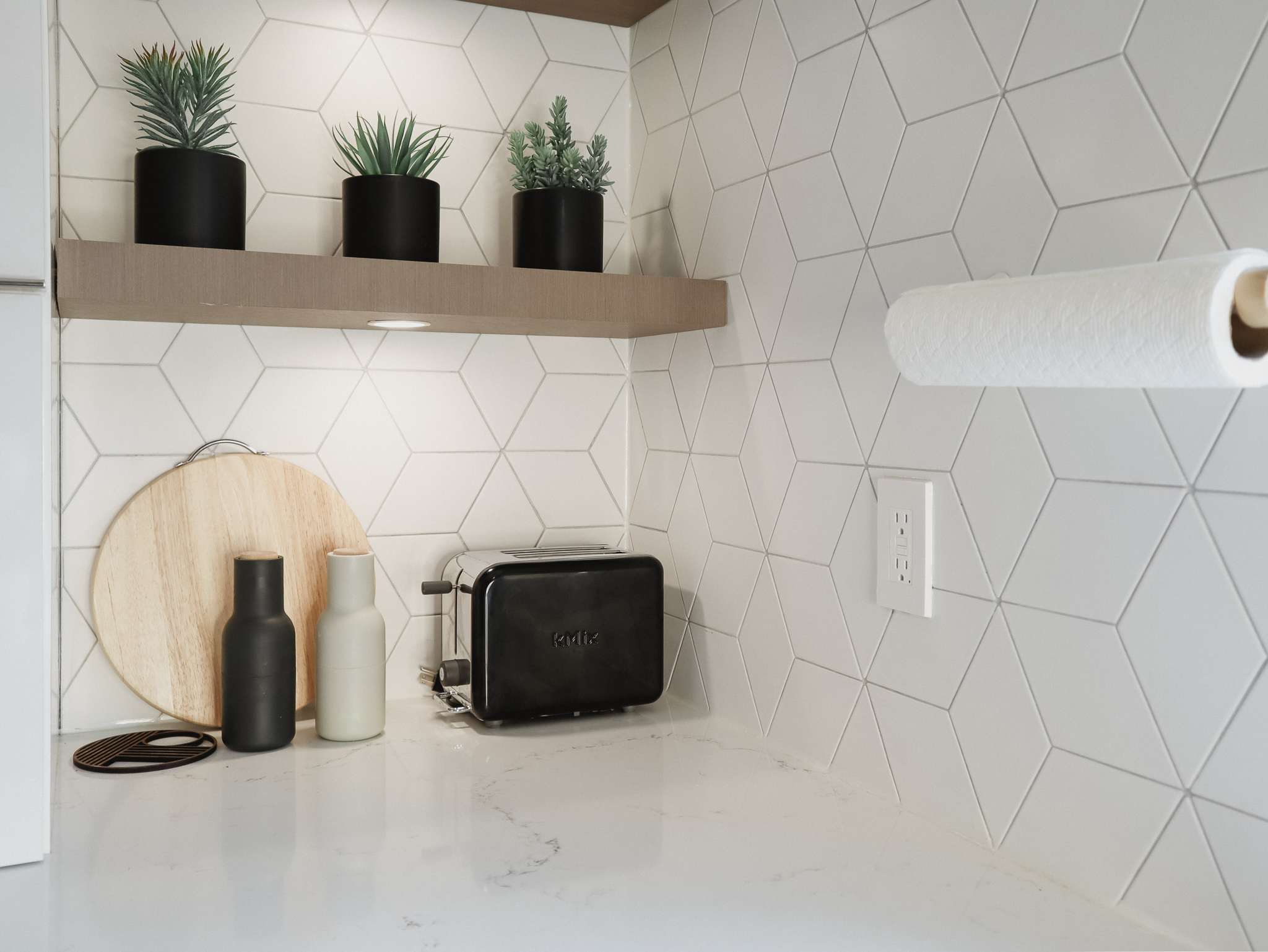
At the essence of both Japanese & Scandinavian styles, you need to declutter your space. Follow Marie Kondo’s philosophy, if it doesn’t spark joy, discard it! But you can’t discard everything and there are key things you will need and use —like an Instant Pot. These items need to have a purpose, whether it’s functional like the Instant Pot or aesthetics like my plants.
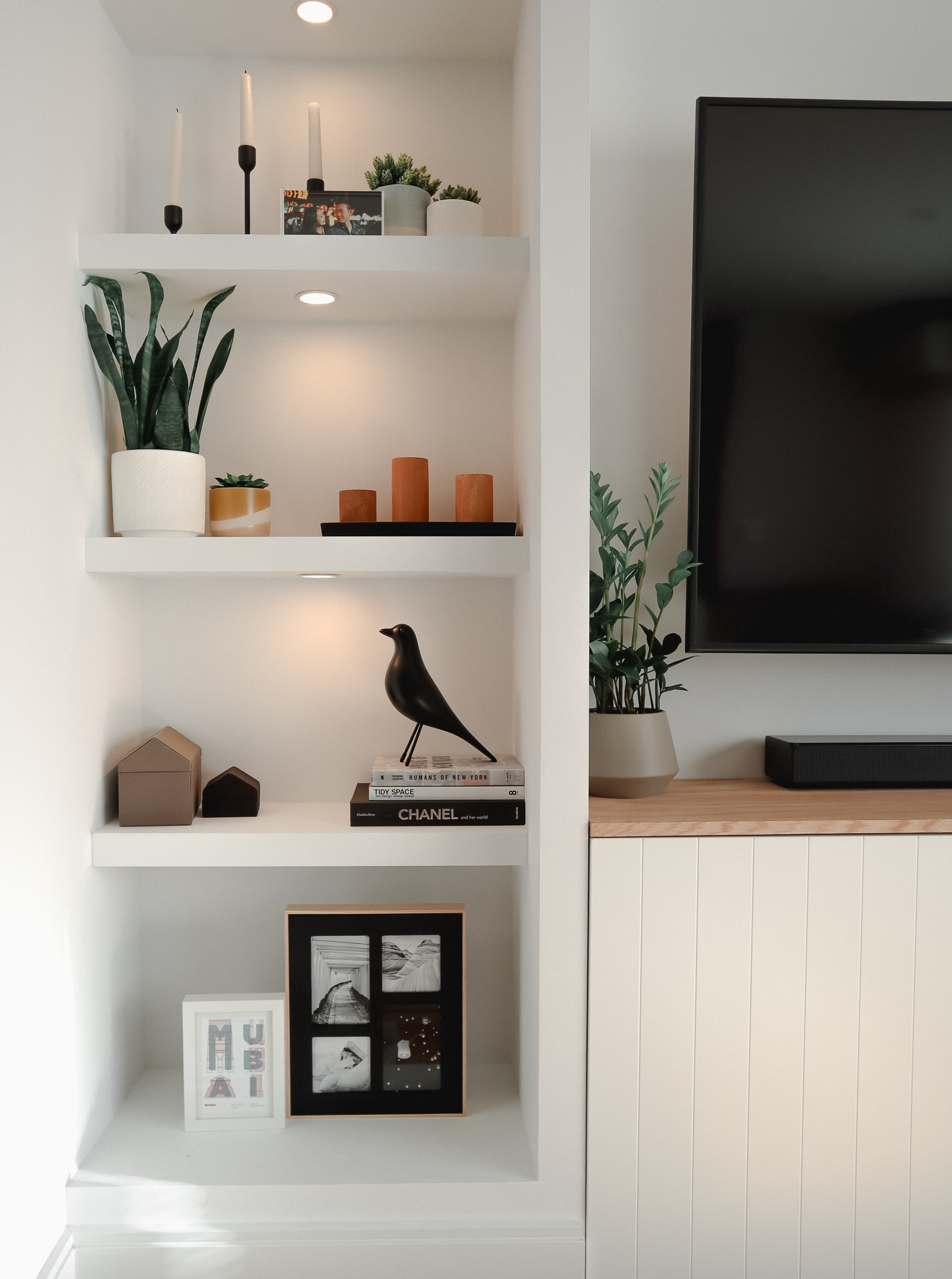
Each item must have a dedicated home so you know where to put it back when it’s moved. Show off your stylish statement pieces but hide the functional but not attractive items in closets, cupboards, and drawers.
Be intentional in where your place items in your home! Show off the pretty pieces you want to see every day while hiding unattractive ones.
Yes, you need an Instant Pot in your life but you don’t need it to sit on your countertop every day (unless you use it daily, then be intentional and style where it lives). Finding items that are both stylish and functional is the main objective when shopping and this is what I’m hoping to help you achieve with this blog.
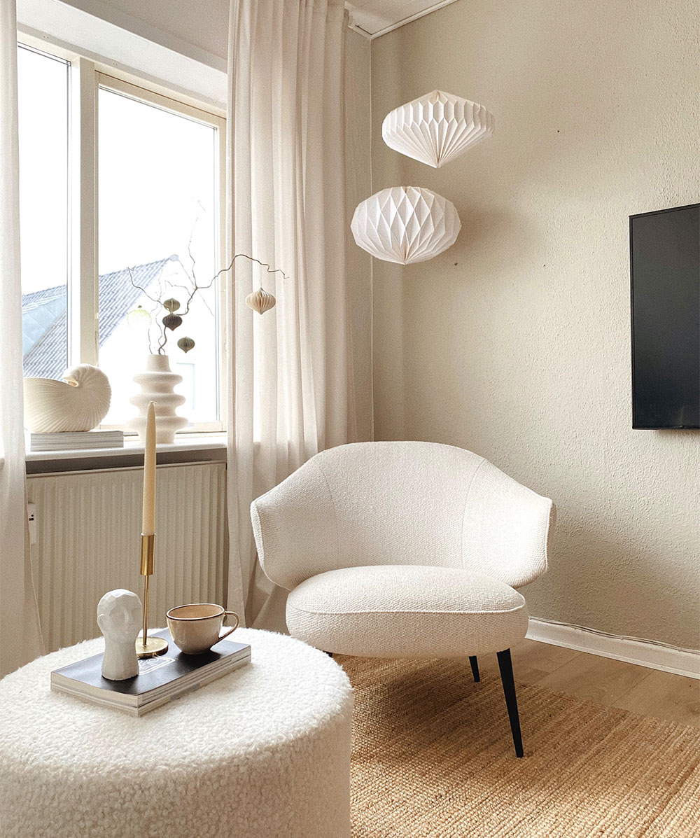
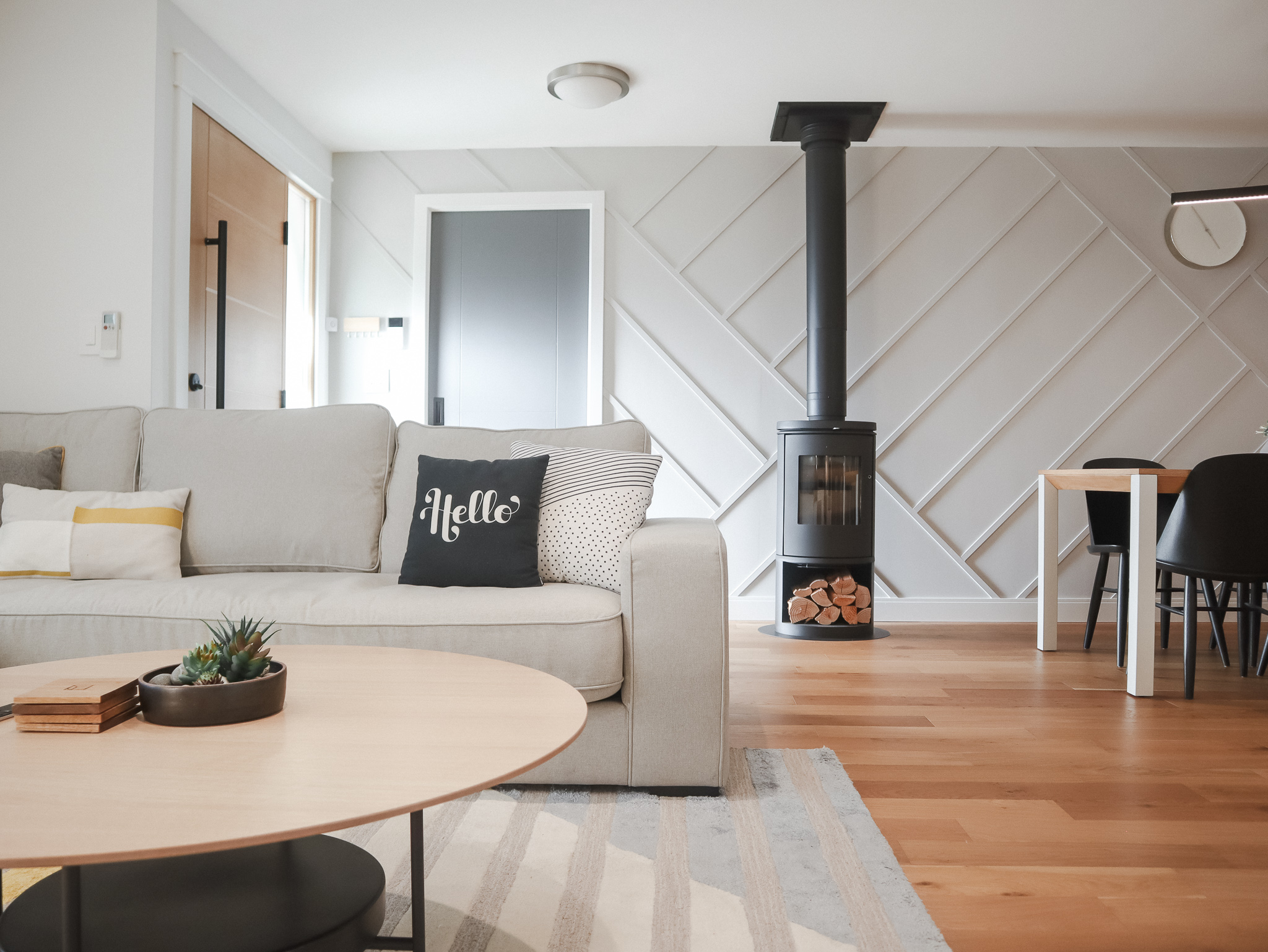
Use natural and cozy textures
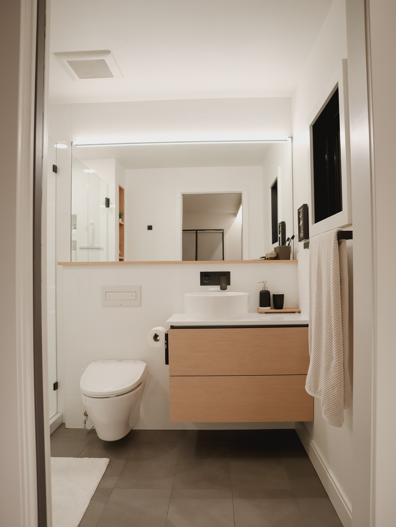
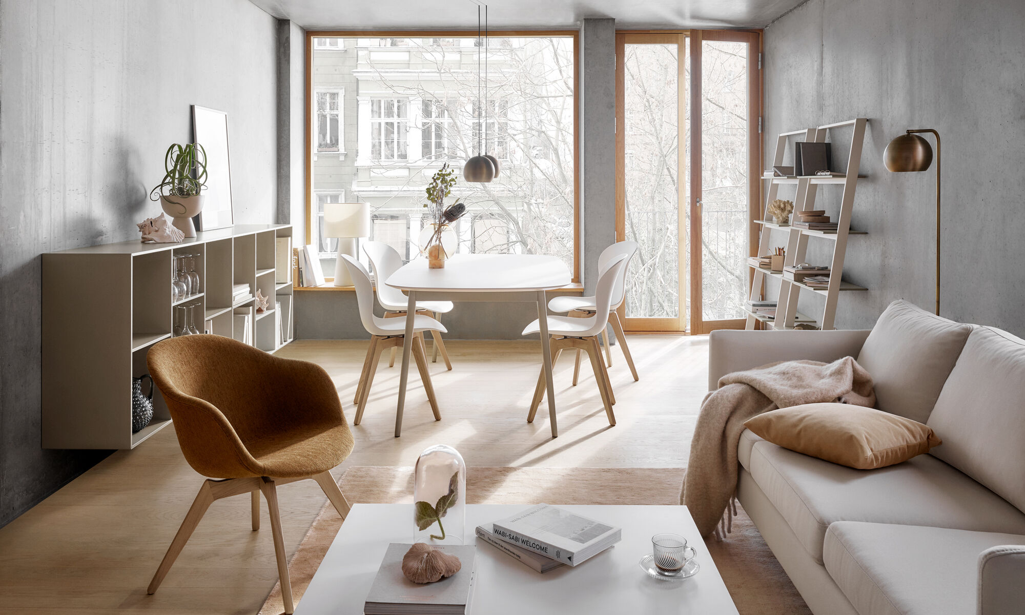
Balance hard dense natural materials like woods and concrete with soft light textures like sheepskin rugs and knitted throws. Use light wood tones such as beech, ash, and pine to create a zen-like space. Avoid red or rustic woods like mahogany or any weathered barn wood—these just feel a bit too artificial or look too busy in a Japandi space.
Use neutral warm colors
I find true Scandinavian grey tones too stark and crisp on their own. That’s why the Japanese warm interiors complement the nordic tones in my space. There is a subtle difference between cool greys (hint of blues) and warm greys (hint of browns) —go with the warmer brownish-grey tones.
I also suggest adding a splash of accent colors to show off your personality. This could show up in your vases, art, throw pillows, or decoration objects. Stick with colors you find in nature like greens and browns or pale colors like light blues, soft pinks, or even mustard yellow (think Easter spring colors!). I’d avoid loud colors like orange, reds, or aqua.
Embrace natural light
Make your space feel larger and brighter with natural light. This means, use white walls to reflect light and keep window treatments minimal. Add more lamps to brighten up your space. I highly recommend using 3500K warm LED bulbs —not too yellow (2700K) like a medieval chamber and not too cool (5000K) like a medical lab.
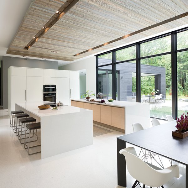
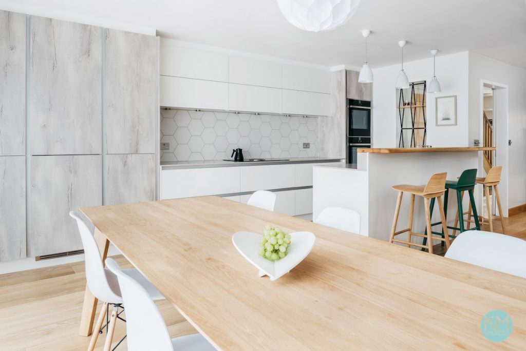
Style with modern furniture & decor
You can’t exactly google “Japandi” furniture but “Scandinavian” and “Modern” pieces are pretty common these days. Start your hunt with common modern furnishing shops like IKEA, West Elm, or Crate & Barrel (US stores). Buy pieces that focus on sleek and clean lines.
Comments (2)
Anita Cho
April 13, 2021 at 4:44 pm
Thanks for the run down of the Japandi interior style! Would love to know more of paint colour options you chose or would recommend.
Living in Seattle and moving into my first home here soon and having been creating a mood board. Inspiring to see a Seattlite turn their home into the exact warm cozy space I’m looking for!
Karen
April 14, 2021 at 2:16 am
Hi Anita!
We mostly used greys and whites in our home and that’s what I’d recommend most of the time. What’s tough is when you go into a paint store, you’ll see thousands of greys and whites. This is multiplied between brands too. For a white, pick something with a warmer undertone (a tiny hint of beige) instead of a cooler tone (a tiny hint of blue). You’ll start to see it in the paint store when you compare whites. To be specific, we used Benjamin Moore “white” vs. “super white” “pure white” “decorator white”.
You could add some accent walls with color to add some character and I’d recommend anything pastel, light, and airy such as pale pink, soft blues, etc. We didn’t do this color but instead a couple of darker grey walls. To be specific, we used Benjamin Moore “charcoal slate” and a light one that I can’t quite find my swatch. Tip! always keep your swatch for future touchups.
Calvin, my general contractor husband’s favorite brand of paint is Benjamin Moore. He has tried Behr and Sherman Willams but it doesn’t paint as smoothly as Benjamin Moore. Their store in Seattle is also great service!
Hope this help!